This is not my hat: https://www.amazon.co.uk/This-Not-Hat-Jon-Klassen/dp/1406353...
Black dog: https://www.amazon.co.uk/Black-Dog-Levi-Pinfold/dp/184877052...
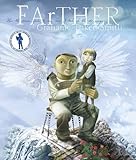
FArTHER: https://www.amazon.co.uk/FArTHER-Grahame-Baker-Smith/dp/1848... (Sadly this book uses a stupid font. Other than that it's lovely.)
Pirate Diary: https://www.amazon.co.uk/Pirate-Diary-Journal-Jake-Carpenter...
I get these from the CILIP Kate Greenaway award. Once you know the name of the writer, or illustrator, or even publisher, you can usually find more good books. http://www.carnegiegreenaway.org.uk/greenaway.php
CILIP is a UK librarian organisation. The US equivalent award is probably something like the Caldecott Medal: http://www.ala.org/alsc/awardsgrants/bookmedia/caldecottmeda...


Talk about it - talk about how it's easy to use this app because the designers made it easy to use, or it's hard to use this app because the designers made it hard to use. When reading books talk about the images and the fonts. (For example, Sam and Dave Dig A Hole has lovely drawings, large print, and a clean simple font with high contrast. Farther has a weird font in a low contrast.)
Involve them in decisions about decoration and room layout. Introduce simple design and art concepts early, and help them spot patterns. "Colour wheels" are simple enough, so you could buy a bunch of paint and do some potato printing with complementary colours, and clashing colours.
https://www.amazon.co.uk/Sam-Dave-Dig-Hole-Barnett/dp/140636...
https://www.amazon.co.uk/FArTHER-Grahame-Baker-Smith-x/dp/18...
PS: If you're involved in children's books, and you want to use a weird font: just fucking don't.