https://www.amazon.com/Grid-Systems-Graphic-Design-Communica...
Some very famous graphic designers used a grid as the basis of their designs.
http://www.amazon.com/Grid-Systems-Graphic-Design-Communicat...
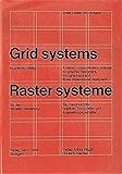
I recommend Josef Muller-Brockmann's Grid Systems in Graphic Design: http://www.amazon.com/Grid-Systems-Graphic-Design-Communicat... or Emil Ruder's Typographie: http://www.amazon.com/Typographie-Manual-Design-Emil-Ruder/d....
There are many, many other good resources but those are important primary sources. So is The Elements of Typographic Style, by Robert Bringhurst: http://www.amazon.com/gp/product/0881792128/ref=pd_lpo_sbs_d....
There are plenty of abstract design theories to study, but when it comes down to actually working, there is no substitute for a mastery of the basics. Paul Rand has some practical thoughts on design in his books.
Overall, I would place an emphasis on learning to articulate the problems you need to solve through design. Design is not something you can learn in the abstract—there can be no effective design without first defining the problem(s) your project presents. I would say design is 90% problem solving and 10% aesthetics.
I've found the best way to learn design is to first understand the basics, then go out and apply them to the designs you encounter. Look at other interface/web designs and ask yourself questions based on the principles you've learned. The key here is to understand the "why" behind the "how".
As for the "how", project-based tutorials are okay, but you should be careful not to get lost in the actual project. You want to be gathering techniques, not just following steps.
Resources Wikipedia: Elements & Principles of Design http://en.wikipedia.org/wiki/Design_elements_and_principles
Anything you can find by Paul Rand. Some of his books are out of print, but if you're creative you can find them on the web.
Grid Systems In Graphic Design by Josef Muller-Brockmann http://www.amazon.com/Systems-Graphic-Systeme-Visuele-Gestal...
2. [Emotional Design: Why We Love (or Hate) Everyday Things](http://www.amazon.com/exec/obidos/tg/detail/-/0465051359/) by Don Norman
3. [The Elements of Typographic Style](http://www.amazon.com/Elements-Typographic-Style-Robert-Brin...) by Robert Bringhurst
4. [Grid Systems](http://www.amazon.com/Systems-Graphic-Systeme-Visuele-Gestal...) by Josef Muller-Brockmann
5. [Ordering Disorder: Grid Principles for Web Design](http://www.amazon.com/Ordering-Disorder-Principles-Design-Vo...) by Khoi Vinh
6. [Why Customers Really Buy: Uncovering the Emotional Triggers That Drive Sales](http://www.amazon.com/Why-Customers-Really-Buy-Uncovering/dp...) by Linda Goodman (I've had the pleasure of meeting her and overhearing her office conversation during my daily tasks at the office in Houston, where she worked for a spell. Incredibly sharp, and it is clear that her principles exposed in this book are thorough-going in her interactions with people. I think it would be important to apply her research to Lean methodologies, building Features only around Emotional Triggers. This is what we are aiming at, but I am making this connection right now, I believe, in saying this.)
7. [Contextual Design: Defining Customer-Centered Systems](http://www.amazon.com/Contextual-Design-Customer-Centered-In...) by Hugh Beyer, Karen Holtzblatt
https://en.wikipedia.org/wiki/Jan_Tschichold
http://www.amazon.com/Systems-Graphic-Systeme-Visuele-Gestal...
https://en.wikipedia.org/wiki/The_Elements_of_Typographic_St...
Basically you need look at your design in order to determine what would make most sense.
A very popular choice is to divide it into three equal sizes and then have one of them be the right or left column, while the two others combine to form the other column.
So you end up with two columns one for content and one for navigation (typical blog look)
Grids can obviously also be much more complicated as those used in photoshop, 3dmax, word or windows/osx.
If you want to get really into grids I can recommend probably the best book written about them.
Josef Muller Brockman Grid Systems
http://www.amazon.com/Systems-Graphic-Systeme-Visuele-Gestal...
It's primarily used as an aid for visual layouts, but it took on the other useful qualities everyone else has listed as the grid frameworks got popular in the web.


Design have two aspects, the doing (drawing, documenting, adjusting) and the thinking (what’s the actual problem and the concept to solve it, which will give me a frame of choices). There is a lot of content on solving the right problem - check the resources from IDEO, or for a broader view Don Norman for example https://www.amazon.com/Design-Everyday-Things-Revised-Expand...
Also don’t forget typography basics since most websites, apps and documents are mostly only text, there are lots of tutorials out there.