Found in 2 comments on Hacker News
asolove · 2013-09-09
· Original
thread
It's important not to oversell the touchy-feely/what-looks-good side of this. Font design is certainly about planning and calculation, it's just that those calculations need to be based on optics rather than geometry.
Instead of perfect circles, we use a shape that is taller than it is wide; instead of splitting the space in half, cross-strokes should be higher than the middle; different strokes need to be different widths in order to appear the same, etc.
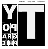
There are plenty of actual scientific studies and theory behind this. See Ruder's Typography [0] and Hochuli's Detail in typography [1] for more info.
[0] http://www.amazon.com/Typographie-Manual-Design-Emil-Ruder/d...
[1] http://www.amazon.com/Detail-Typography-Jost-Hochuli/dp/0907...


I recommend Josef Muller-Brockmann's Grid Systems in Graphic Design: http://www.amazon.com/Grid-Systems-Graphic-Design-Communicat... or Emil Ruder's Typographie: http://www.amazon.com/Typographie-Manual-Design-Emil-Ruder/d....
There are many, many other good resources but those are important primary sources. So is The Elements of Typographic Style, by Robert Bringhurst: http://www.amazon.com/gp/product/0881792128/ref=pd_lpo_sbs_d....