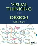
Either way, between Cleveland, Robins, Few, and Ware there're tons of studies and references:
http://cm.bell-labs.com/cm/ms/departments/sia/wsc/index.html
http://www.researchgate.net/researcher/2028337238_Naomi_B_Ro...
http://www.perceptualedge.com/library.php
http://www.amazon.ca/Visual-Thinking-Design-Colin-Ware/dp/01...
Better is subjective though and related to what you're trying to do. A lot of past research was about efficiency of information transfer. There's more recent research looking at memorability. In one report, different graphics could have both goals.
There's a "Useful Junk" paper delving into that topic. There's a link to it in Few's reply: http://www.perceptualedge.com/articles/visual_business_intel...
There's plenty more. Stanford Vis group is a fun place to check from time to time: http://vis.stanford.edu/ Heer specifically has a range of papers and some online slides for a vis course he taught http://homes.cs.washington.edu/~jheer/ (uses Tufte for the course text)
I'm drawing a blank on a few others I find informative...
Unfortunately, I don't have any about fonts but I'm sure there are plenty out there.
First – the photo that is used as "evidence" caught my eye quickly because it is clearly poorly processed/improperly exposed. There is no black point and that's a bad thing for the image; which leads me to say – you can't make the sweeping generalization that black is always bad. It's not – and the work of one pop art painter and a bad bit of photography isn't substantiated proof.
If you want to actually make something meaningful out of this, you'd actually push hard on the idea that too much contrast is a bad thing. Black isn't bad. Heavy contrast can be. Instead, get down to the root reasons that we have issues with contrast – in short, we're wired to notice differences in color or brightness than we are for absolute values of color or brightness. As such, it's not about one color, it's about the contrast.
Check out Jeff Johnson's Designing with the Mind in Mind: http://www.amazon.com/Designing-Mind-Simple-Understanding-In... or Colin Ware's Visual Thinking for Design: http://www.amazon.com/Visual-Thinking-Kaufmann-Interactive-T...
Both of those do a much better job at explaining the hows and whys of the average person's visual perception.
I didn't include it because I don't think it's for beginners, but it's super informative.


Ref: https://www.amazon.com/Visual-Thinking-Kaufmann-Interactive-...